Course Project Individual Report: Does a Country’s Geographic Characteristics Affect Performance at the Olympics?
Author
Chris Liu
Introduction
There are a plethora of reasons why a country attains success at the Olympics, there is no singular factor influencing the outcome. Rather, there are a culmination of factors that come together to make a country succeed at this international competition. In this report, I’ll explore one of those potential factors; the geographic characteristics of a country.
This analysis will specifically look into the relationship between the geographic characteristics of a country and the performance at the Olympic games.
Data Acquisition
R Packages
Code
#The following R packages will be usedlibrary(tidyr)library(dplyr)library(stringr)library(readr)library(rvest)library(sf)library(viridis)library(ggplot2)library(WDI)library(DT)library(gganimate)library(shiny)library(shinyWidgets)library(rsconnect)
The backbone of the data analysis will be conducted on the historical outcomes of the Olympic Games. This data set will be acquired from Kaggle, found here. Kaggle requires signing into a free account to download files. Due to this restriction, hand downloading the file is the simplest way to get the data. The specific CSV we’ll work with from the available files is Olympic_Medal_Tally_History.csv.
Code
### Importing Data #### import medal count data by reading the CSV file, the file path directory may need to be changed depending where you save itmedal_tally <-read_csv("Olympic_Medal_Tally_History.csv")
The next set are coordinate systems for each country in the world. These are readily available from Google Developers. This data can be web scraped and imported into the work environment directly.
Once the country coordinate data has been loaded, we inspect any issues related to joining it with our Olympic Games data. An anti-join is used to generate a list of participants in Olympic history that don’t appear in the country coordinate data. There are a multitude of reasons why some participants may not show up in the coordinate data:
Nations that no longer exist (e.g., USSR, West Germany, East Germany).
Adjusted naming schemes (e.g., Czechia ~ Czech Republic, Great Britain ~ United Kingdom).
Special case naming schemes (e.g., ROC ~ Russia, Unified Team ~ former Soviet Union).
As a result, some participants will be adjusted to their modern day location. In the context of this analysis, this should not generate drastic bias since the analysis will be focused on geographic location and features. For example, grouping the medals won by East and West Germany together won’t be an issue since the physical location of the country is the subject of study. Nevertheless, take this into consideration when following along with the analysis.
Code
# import country longitude & latitude data from Google Developers# load the webpagecoordinates_webpage <-read_html("https://developers.google.com/public-data/docs/canonical/countries_csv")# extract the table/CSV directly from embedded webpagecountry_coordinates <- coordinates_webpage |>html_table()# convert table into a dataframecountry_coordinates <- country_coordinates[[1]] # only 1 table exists on the html page# organize the coordinates table, limitations are the coordinates are like an average since some countries are hugecountry_coordinates <- country_coordinates |>select(name, latitude, longitude) |>rename(country = name) |># renaming to make joining conventionsmutate(hemisphere =ifelse(latitude >=0, "Northern", "Southern")) # designating geographical categories, starting with hemispheres# some Olympic competing country names are not the same as the coordinates, let's look at what these are:missing_countries <- medal_tally |>anti_join(country_coordinates, by ="country") |>distinct(country) |>select(country) |>arrange((country))print(missing_countries)# I'm renaming these countries to their modern locations as listed in the coordinates data since analysis will be done by geography/location, don't particularly care about its history# there are a few that wont get designated such as the Mixed Team and West Indies Federationmedal_tally <- medal_tally |>mutate(country =case_when( country =="Australasia"~"Australia", country =="Bohemia"~" Czech Republic", country =="Chinese Taipei"~"Taiwan", country =="Czechia"~"Czech Republic", country =="Czechoslovakia"~"Czech Republic", country =="Democratic People's Republic of Korea"~"North Korea", country =="East Germany"~"Germany", country =="Great Britain"~"United Kingdom", country =="Hong Kong, China"~"Hong Kong", country =="Islamic Republic of Iran"~"Iran", country =="Kingdom of Saudi Arabia"~"Saudi Arabia", country =="North Macedonia"~"Macedonia [FYROM]", country =="People's Republic of China"~"China", country =="ROC"~"Russia", country =="Republic of Korea"~"South Korea", country =="Republic of Moldova"~"Moldova", country =="Russian Federation"~"Russia", country =="Serbia and Montenegro"~"Serbia", country =="Soviet Union"~"Russia", country =="Syrian Arab Republic"~"Syria", country =="The Bahamas"~"Bahamas", country =="Türkiye"~"Turkey", country =="Unified Team"~"Russia", country =="United Republic of Tanzania"~"Tanzania", country =="United States Virgin Islands"~"U.S. Virgin Islands", country =="West Germany"~"Germany", country =="Yugoslavia"~"Serbia",TRUE~ country # don't change anything else mentioned outside of the above list )) |>filter(year >1960) # only looking at more recent Olympic Games to get a better picture of insights# although some names of been updated and some share the same country name, the aggregation of medals will come later
Lastly, we will ingest population data from the World Bank. Luckily, this data is readily available in the library(WDI) package. Alternatively, the same data can be obtained from the World Bank API but there are limitations using the API. To keep it as simple as possible, using the dedicated R package is the best idea. The population data is used to help normalize the analysis and conclusions about population can be drawn from the normalization.
As discussed earlier, there will be data that is incompatible join to the Olympic Games data. Once again we’ll take a look at what those are and identify similar reasoning as discussed earlier.
Code
# WDI population# generate the sequence of years: every two years from 1960 to 2024 (data limited to 1960 and onward), every two years for Olympic yearsyears_of_interest <-seq(1960, 2024, by =2)# fetch population data for all years (WDI does not directly support filtering by step years)population_data <-WDI(indicator ="SP.POP.TOTL", start =1960, end =2024)# filter the data to include only the years in the sequencefiltered_population_data <- population_data[population_data$year %in% years_of_interest, ]filtered_population_data <- filtered_population_data |>select(-iso2c, -iso3c) |># get rid of unnecessary columnsrename(population = SP.POP.TOTL)# rename country's in population data to join properlymissing_population_countries <- medal_tally |>anti_join(filtered_population_data, by ="country") |>distinct(country) |>select(country) |>arrange((country))print(missing_population_countries)# Taiwan left out due to political reasons, grouped with China. Taking a deeper look they only won a handful of medals so leaving this data out shouldn't cause a large influence in the data analysisfiltered_population_data <- filtered_population_data |>mutate(country =case_when( country =="Bahamas, The"~"Bahamas", country =="Czechia"~"Czech Republic", country =="Cote d'Ivoire"~"Côte d'Ivoire", country =="Egypt, Arab Rep."~"Egypt", country =="Hong Kong SAR, China"~"Hong Kong", country =="Iran, Islamic Rep."~"Iran", country =="Kyrgyz Republic"~"Kyrgyzstan", country =="North Macedonia"~"Macedonia [FYROM]", country =="Korea, Dem. People's Rep."~"North Korea", country =="Korea, Rep."~"South Korea", country =="Russian Federation"~"Russia", country =="Slovak Republic"~"Slovakia", country =="Syrian Arab Republic"~"Syria", country =="Turkiye"~"Turkey", country =="Virgin Islands (U.S.)"~"U.S. Virgin Islands", country =="Venezuela, RB"~"Venezuela", country =="Viet Nam"~"Vietnam",TRUE~ country # don't change anything else mentioned outside of the above list ))# join to medal tally data framemedal_tally <- medal_tally |>left_join(filtered_population_data,by =c("country"="country", "year"="year") )
We will be focusing on Olympic Games from 1960 and onward to get a better picture of national participation. Additionally, a weighted medal system will be implemented in the analysis. The worth of a gold medal will be three times a bronze and the worth of a silver medal will be twice a bronze. Keep this in mind when interpreting the count of medals in the analysis.
Code
# weigh the medal counts by different value, gold is ranked 3 times more than bronze, silver is ranked 2 times more than bronzemedal_tally <- medal_tally |>mutate(gold = gold *3,silver = silver *2,total = gold + silver + bronze )### end of data import ###
Analysis
Exploration of Olympic Data
The analysis will take a look at the Summer and Winter Olympics separately. The difference in the amount of medals distributed in the Summer Games versus the Winter Games is drastic. Let’s take a look at historically how many medals have been given out.
Code
# calculate total of weighted medals awarded for Winterwinter_games_total_medal_count <- medal_tally |>filter(str_detect(edition, "Winter")) |>summarize(total_medals_awarded =sum(total))print(paste0("The total weighted amount of medals distributed throughout the Winter Olympics is ", winter_games_total_medal_count, " medals."))
[1] "The total weighted amount of medals distributed throughout the Winter Olympics is 6067 medals."
Code
# calculate total of weighted medals awarded for Summersummer_games_total_medal_count <- medal_tally |>filter(str_detect(edition, "Summer")) |>summarize(total_medals_awarded =sum(total))print(paste0("The total weighted amount of medals distributed throughout the Summer Olympics is ", summer_games_total_medal_count, " medals."))
[1] "The total weighted amount of medals distributed throughout the Summer Olympics is 23120 medals."
Next we’ll take a look at each country’s aggregated historical performance at the Olympic Games.
Code
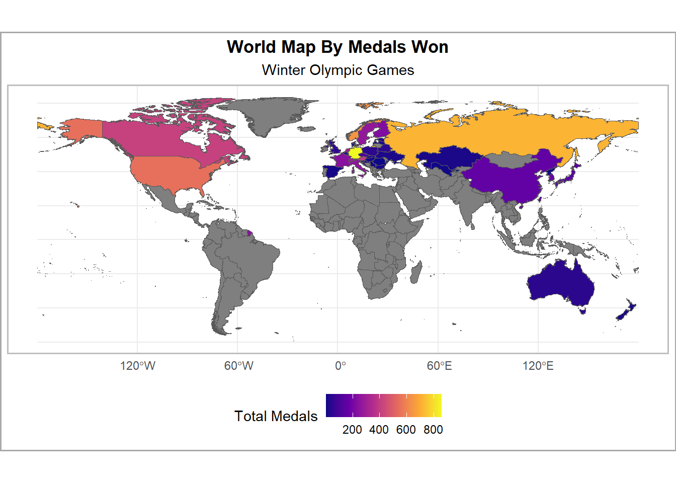
# get sf files for plottingurl <-"https://datacatalogfiles.worldbank.org/ddh-published/0038272/DR0046659/wb_countries_admin0_10m.zip?versionId=2024-05-14T14:58:01.5696428Z"# Define the destination file path with the new namedestfile <-"world_map.zip"# Check if the file already exists and download only if it does notif (!file.exists(destfile)) {download.file(url, destfile, mode ="wb")}# extract sf file functionread_shp_from_zip <-function(zip_file) { temp_dir <-tempdir() # create a temporary directory zip_contents <-unzip(zip_file, exdir = temp_dir) # unzip the contents and shp_file <- zip_contents[grepl("\\.shp$", zip_contents)] # filter for .shp files sf_object <-read_sf(shp_file) # read the .shp file into an sf objectreturn(sf_object) # return the sf object}world_shapefile <-read_shp_from_zip("world_map.zip")# adjust namesworld_shapefile <- world_shapefile |>mutate(NAME_EN =case_when( NAME_EN =="United States of America"~"United States", NAME_EN =="People's Republic of China"~"China",TRUE~ NAME_EN ))# find all time medal count by country in the winter Olympicswinter_medal_count <- medal_tally |>filter(str_detect(edition, "Winter")) |>group_by(country) |>summarize(total_medals =sum(total), # count total medals won all timetotal_gold =sum(gold), # count total gold medals won all timetotal_silver =sum(silver), # count total silver medals won all timetotal_bronze =sum(bronze) ) |># count total bronze medals won all timeselect(country, total_medals, total_gold, total_silver, total_bronze) |>arrange(desc(total_medals))# join winter medal count to sf filewinter_medal_world_map <- world_shapefile |>left_join( winter_medal_count,join_by(NAME_EN == country) )# plot medal count heat mapggplot(winter_medal_world_map, aes(fill = total_medals)) +geom_sf() +labs(title ="World Map By Medals Won",subtitle ="Winter Olympic Games" ) +scale_fill_viridis_c(name ="Total Medals", option ="plasma") +theme_minimal() +theme(legend.position ="bottom",panel.border =element_rect(color ="gray", fill =NA, size =1),plot.background =element_rect(fill ="white", color ="darkgrey", size =1),panel.background =element_rect(fill ="white"),plot.title =element_text(hjust =0.5, face ="bold"),plot.subtitle =element_text(hjust =0.5) )
Code
# clean up names for data table displaywinter_medal_count_tabular <- winter_medal_count |>rename(Country = country,`Total Medals`= total_medals,`Gold Medals`= total_gold,`Silver Medals`= total_silver,`Bronze Medals`= total_bronze )datatable(winter_medal_count_tabular, caption ="Winter Olympic Medal Distribution")
Code
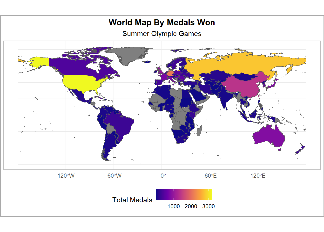
# find all time medal count by country in the summer Olympicssummer_medal_count <- medal_tally |>filter(str_detect(edition, "Summer")) |>group_by(country) |>summarize(total_medals =sum(total), # count total medals won all timetotal_gold =sum(gold), # count total gold medals won all timetotal_silver =sum(silver), # count total silver medals won all timetotal_bronze =sum(bronze) ) |># count total bronze medals won all timeselect(country, total_medals, total_gold, total_silver, total_bronze) |>arrange(desc(total_medals))# join summer medal count to sf filesummer_medal_world_map <- world_shapefile |>left_join( summer_medal_count,join_by(NAME_EN == country) )# plot medal count heat mapggplot(summer_medal_world_map, aes(fill = total_medals)) +geom_sf() +labs(title ="World Map By Medals Won",subtitle ="Summer Olympic Games" ) +scale_fill_viridis_c(name ="Total Medals", option ="plasma") +theme_minimal() +theme(legend.position ="bottom",panel.border =element_rect(color ="gray", fill =NA, size =1),plot.background =element_rect(fill ="white", color ="darkgrey", size =1),panel.background =element_rect(fill ="white"),plot.title =element_text(hjust =0.5, face ="bold"),plot.subtitle =element_text(hjust =0.5) )
Code
# clean up names for data tablesummer_medal_count_tabular <- summer_medal_count |>rename(Country = country,`Total Medals`= total_medals,`Gold Medals`= total_gold,`Silver Medals`= total_silver,`Bronze Medals`= total_bronze )datatable(summer_medal_count_tabular, caption ="Summer Olympic Medal Distribution")
Comparing the top 10 performing countries in each set, we have a few overlapping nations. We see that Germany, Russia, USA, and Italy intersect in each list. At one point or another in history, these countries were considered superpowers of the world. That’s something we might want to keep in mind.
Furthermore, let’s inspect the historical performance of the top 5 countries in each list to get a better understanding if there has been consistency throughout the years.
Code
# some analysis solely looking at the top 5 winning countries in summer and winter, can look at historical data performance for insightswinter_medal_count_top5 <- winter_medal_count |>slice_max(total_medals, n =5)winter_top_5_performance <- medal_tally |>filter(str_detect(edition, "Winter")) |>filter(country %in% winter_medal_count_top5$country)# animate the performanceanimated_winter_top5 <-ggplot(winter_top_5_performance, aes(x = year, y = total, color = country)) +geom_line(size =1.2) +labs(title ="Winter Olympics Historical Performances",subtitle ="Top 5 Countries With Most Medals",y ="Total Medals Won",x ="Year" ) +facet_grid(country ~ .) +theme_minimal() +theme(legend.position ="none") +transition_reveal(year)# render the animationanimate(animated_winter_top5, nframes =100, fps =10, renderer =gifski_renderer("winter_olympics_animation.gif"))
The timeline shows us that Canada, Germany, Norway and the US have been performing better in the recent years as compared to the past. This might be explained by factors such as more investments into Winter Olympic athletes in the modern century. Canada and the US in particular showcased little success in the past.
Next we can take a look at the Summer Olympics.
Code
# get top 5 performing countries from summer Olympicssummer_medal_count_top5 <- summer_medal_count |>slice_max(total_medals, n =5)summer_top_5_performance <- medal_tally |>filter(str_detect(edition, "Summer")) |>filter(country %in% summer_medal_count_top5$country)# animate the performanceanimated_summer_top5 <-ggplot(summer_top_5_performance, aes(x = year, y = total, color = country)) +geom_line(size =1.2) +labs(title ="Summer Olympics Historical Performances",subtitle ="Top 5 Countries With Most Medals",y ="Total Medals Won",x ="Year" ) +facet_grid(country ~ .) +theme_minimal() +theme(legend.position ="none") +transition_reveal(year) # This creates the animation effect based on the year# render the animationanimate(animated_summer_top5, nframes =100, fps =10, renderer =gifski_renderer("summer_olympics_animation.gif"))
What sticks out right away is that China did not start winning any medals until later in time as compared to the other four countries. Even with a late start in winning medals, the country broke into the top 5 historically performing countries. We might want to think about what factors may have led to their success as compared to other countries that have won medals earlier in time.
Latitude Regression
Now that we’ve gathered some basic insights into the Olympic data, we can move forward to looking at the relationship between geographical factors and success at the Olympics. The first approach is to generate a scatter plot of each countries latitude versus medals won. We’re hoping to find some relationship between the variables.
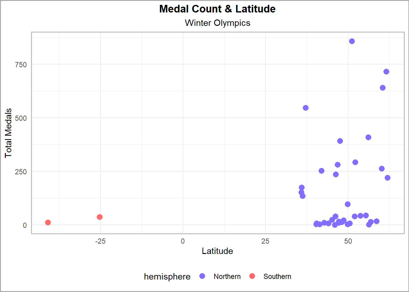
We’ll take a look at the Winter Olympics first.
Code
# assess relationship between latitude and medal count for the Winter Olympics# join coordinate system to the winter medal data framelatitude_medals_winter <- winter_medal_count |>left_join( country_coordinates,join_by(country == country) ) |>select(country, total_medals, latitude, hemisphere) |>na.omit()# plot relationshipggplot(latitude_medals_winter, aes(x = latitude, y = total_medals, color = hemisphere)) +geom_point(size =3) +labs(title ="Medal Count & Latitude",subtitle ="Winter Olympics",x ="Latitude",y ="Total Medals" ) +scale_color_manual(values =c("Northern"="slateblue1", "Southern"="indianred1")) +theme_minimal() +theme(legend.position ="bottom",panel.border =element_rect(color ="gray", fill =NA, size =1),plot.background =element_rect(fill ="white", color ="darkgrey", size =1),panel.background =element_rect(fill ="white"),plot.title =element_text(hjust =0.5, face ="bold"),plot.subtitle =element_text(hjust =0.5) )
There are no winning countries in the Winter Olympics located near the equator. This may support the idea that hotter climate countries see little success at the Winter Games due to lack of resources available to practice sports in winter environments. It’s clear there is no linear relationship that can be established between latitude and medals at the Winter Olympics. We can only draw the conclusion that countries that experience a colder environment will experience more likelihood of success. Note that the majority of the medals are located in the northern hemisphere. This may be attributed to the fact that more countries exist in the northern part of the world.
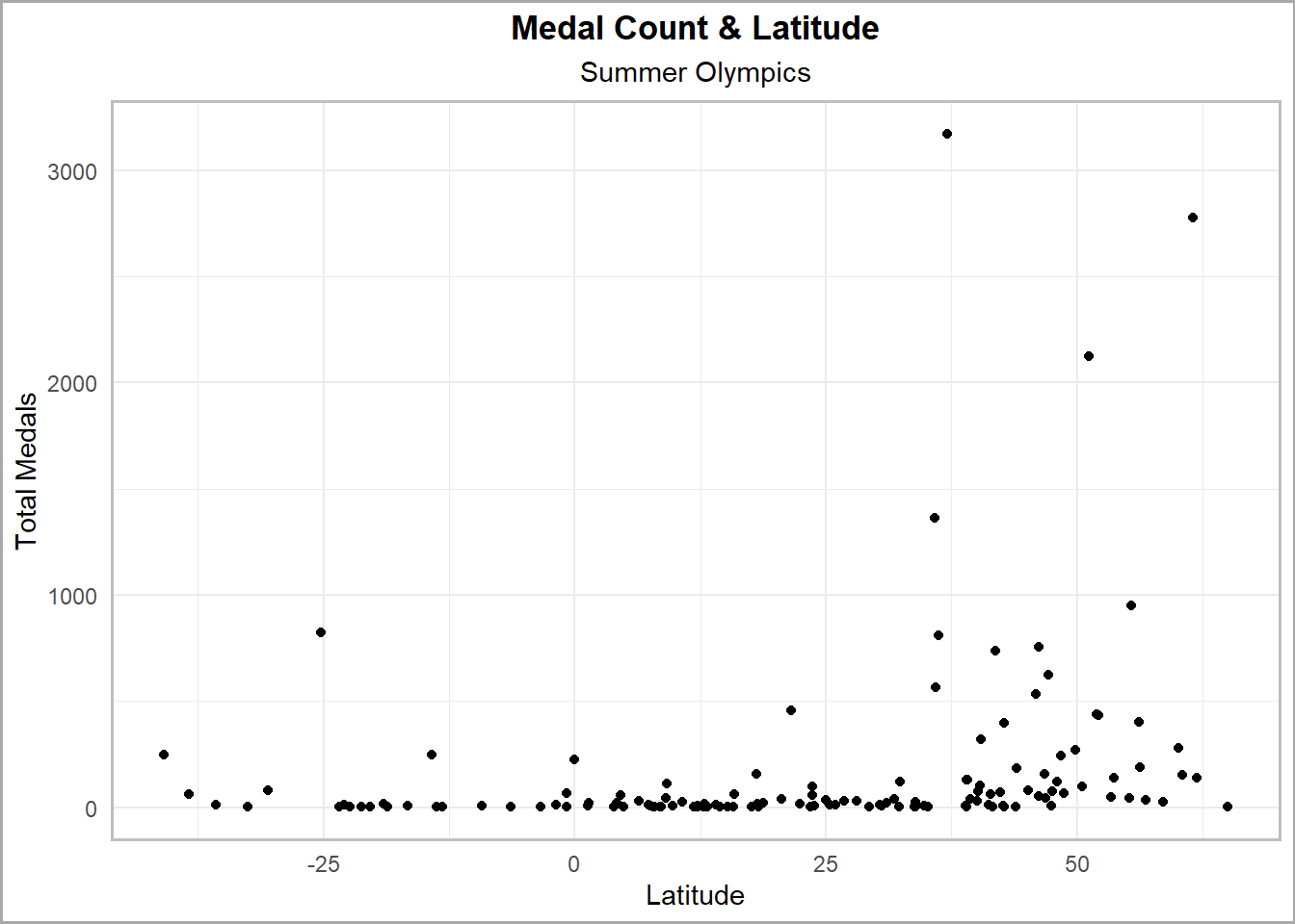
Recall earlier that the Summer Olympics distributes almost four times as many medals as compared to the Winter Olympics. Next we’ll move onto analyzing the same relationship for the Summer games. With more data points available, we’ll expect a more robust analysis available to us to conduct.
Code
# for the summer Olympics latitudelatitude_medals_summer <- summer_medal_count |>left_join( country_coordinates,join_by(country == country) ) |>select(country, total_medals, latitude, hemisphere) |>na.omit()ggplot(latitude_medals_summer |>na.omit(), aes(x = latitude, y = total_medals)) +geom_point() +labs(title ="Medal Count & Latitude",subtitle ="Summer Olympics",x ="Latitude",y ="Total Medals" ) +theme_minimal() +theme(panel.border =element_rect(color ="gray", fill =NA, size =1),plot.background =element_rect(fill ="white", color ="darkgrey", size =1),panel.background =element_rect(fill ="white"),plot.title =element_text(hjust =0.5, face ="bold"),plot.subtitle =element_text(hjust =0.5) )
Code
# visually no linear relationship
There is no obvious linear relationship present between the two variables. Furthermore, there is no distinct conclusion we can draw as seen in the Winter Olympic plot from before. We’ll need to investigate further on how we can derive some insights from the data.
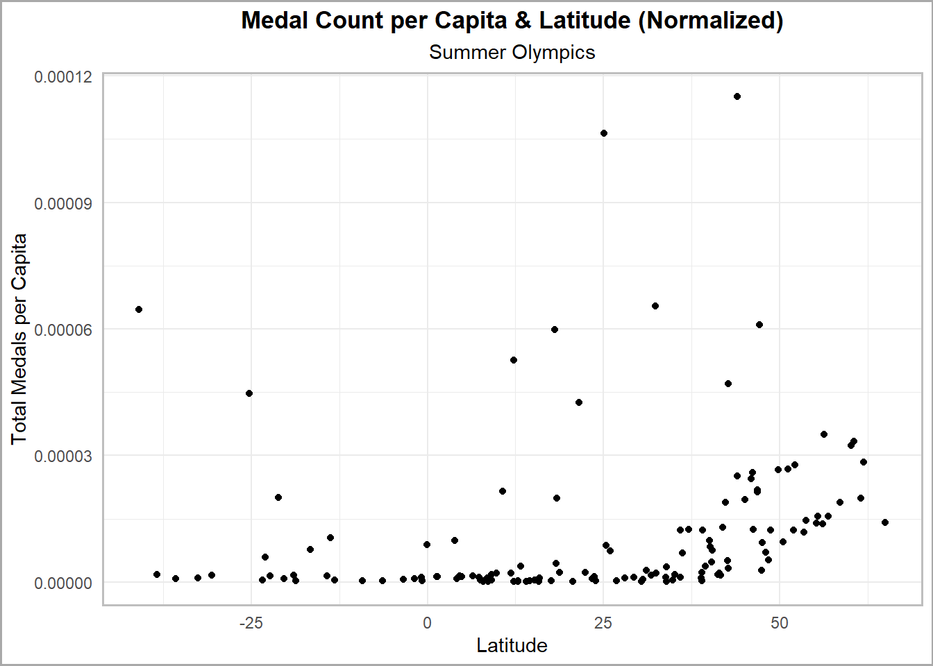
The first method would be to normalize the data by some common factor. Recall that population data was imported earlier. Here we can normalize the total medals won by population. We’ll define the new Y-axis as total medals per capita, so that the analysis will be more objective.
Code
# normalize by population for latitude regressionmedal_tally_normalized <- medal_tally |>mutate(medals_per_capita = total / population)summer_medal_count_normalized <- medal_tally_normalized |>filter(str_detect(edition, "Summer")) |>group_by(country) |>summarize(total_medals_per_capita =sum(medals_per_capita)) |># count total bronze medals won all timeselect(country, total_medals_per_capita)latitude_medals_summer_normalized <- summer_medal_count_normalized |>left_join( country_coordinates,join_by(country == country) ) |>select(country, total_medals_per_capita, latitude) |>na.omit()ggplot(latitude_medals_summer_normalized |>na.omit(), aes(x = latitude, y = total_medals_per_capita)) +geom_point() +labs(title ="Medal Count per Capita & Latitude (Normalized)",subtitle ="Summer Olympics",x ="Latitude",y ="Total Medals per Capita" ) +theme_minimal() +theme(panel.border =element_rect(color ="gray", fill =NA, size =1),plot.background =element_rect(fill ="white", color ="darkgrey", size =1),panel.background =element_rect(fill ="white"),plot.title =element_text(hjust =0.5, face ="bold"),plot.subtitle =element_text(hjust =0.5) )
After normalizing the data, the scatter plot shape remains relatively the same. There’s a slight change on the higher end of the latitude but not enough to warrant a linear relationship still. Although we can’t see anything visually, we draw conclusions by comparing this normalized graph to the regular graph from above.
The similarity in plot shape suggests that population size does not have a significant influence on the relationship between latitude and the number of medals won. If larger populations do not yield a different pattern when you control for them, it implies that other factors may play a more substantial role in determining how many medals a country wins.
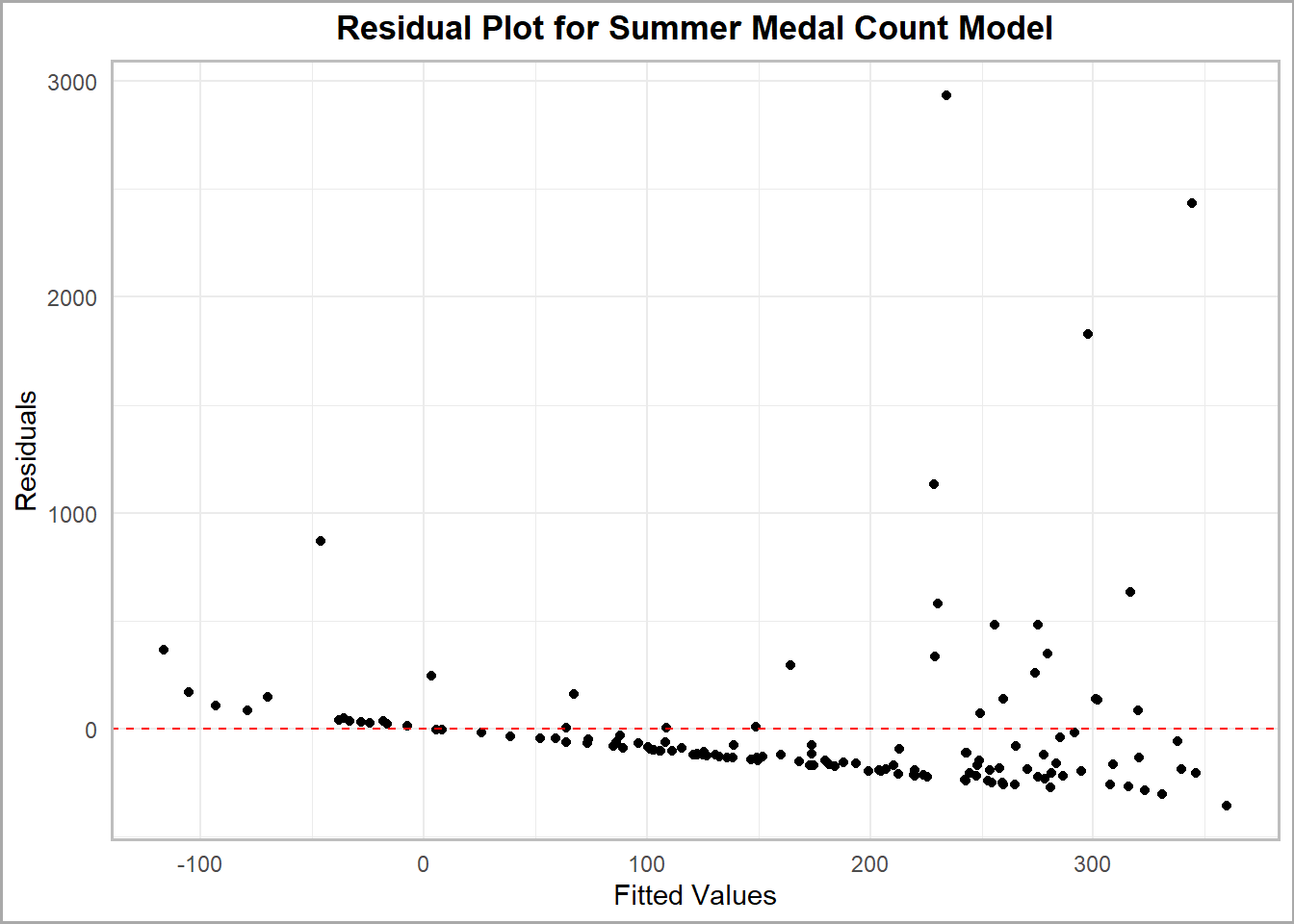
Next, we’ll take a statistical driven method to transform our original plot again to help derive other insights. The first process is to find the residuals of the data to determine what sort of transformation should be done.
Code
# fit a linear modelsummer_model <-lm(total_medals ~ latitude, data = latitude_medals_summer)# pull the residualslatitude_medals_summer$residuals <-residuals(summer_model)# create the residual plotggplot(latitude_medals_summer, aes(x =fitted(summer_model), y = residuals)) +geom_point() +geom_hline(yintercept =0, linetype ="dashed", color ="red") +# plot zero line to interpret residualslabs(title ="Residual Plot for Summer Medal Count Model",x ="Fitted Values",y ="Residuals" ) +theme_minimal() +theme(panel.border =element_rect(color ="gray", fill =NA, size =1),plot.background =element_rect(fill ="white", color ="darkgrey", size =1),panel.background =element_rect(fill ="white"),plot.title =element_text(hjust =0.5, face ="bold"),plot.subtitle =element_text(hjust =0.5) )
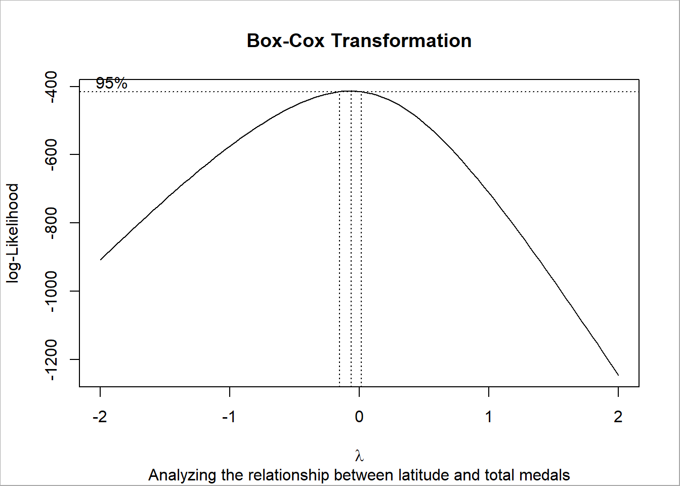
The residual plot shows a violation of constant variance in the data. We already knew that from visually looking at the original plot, but this statistical method confirms our findings. Next we’ll want to perform a transformation on the Y-value in order to generate a better graph to interpret. We can determine the procedure using the Box-Cox transformation.
Code
latitude_data <- latitude_medals_summer$latitudetotal_medals_data <- latitude_medals_summer$total_medals# fit linear model between medals and latitudemodel <-lm(total_medals_data ~ latitude_data)library(MASS) # loading here as this package interferes with dplyr, only using one function momentarily# Box-Cox transformation from MASS packageboxcox_results <-boxcox(model,lambda =seq(-2, 2, 1/10),plotit =TRUE,xlab =expression(lambda),ylab ="log-Likelihood",interp =TRUE,eps =1/50)# add titlestitle(main ="Box-Cox Transformation",sub ="Analyzing the relationship between latitude and total medals")# outer border for aestheticbox(which ="outer", lty ="solid", col ="darkgrey")
Code
detach("package:MASS", unload =TRUE) # unload package in case of any other dplyr interference later
The Box-Cox procedure identifies that 0 falls within the 95% interval of lambda; suggesting a logarithmic transformation on Y.
Code
# transform Y value by applying log10 functionlatitude_medals_summer$total_medals_transformed <-log10(latitude_medals_summer$total_medals)m.transformed_medals <-lm(total_medals_transformed ~ latitude, data = latitude_medals_summer)ggplot(latitude_medals_summer |>na.omit(), aes(x = latitude, y = total_medals_transformed)) +geom_point() +geom_smooth(method ="lm", se =FALSE, color ="lightslateblue") +labs(title ="Medal Count Transformed & Latitude",subtitle ="Summer Olympics",x ="Latitude",y ="Total Medals (Log Scale)" ) +theme_minimal() +theme(panel.border =element_rect(color ="gray", fill =NA, size =1),plot.background =element_rect(fill ="white", color ="darkgrey", size =1),panel.background =element_rect(fill ="white"),plot.title =element_text(hjust =0.5, face ="bold"),plot.subtitle =element_text(hjust =0.5) )
The scatter plot now exhibits a reasonable linear relationship. Drawing conclusions based off this transformation; we can confirm there is a non-linear relationship between latitude and medals won at the Summer Olympics. This suggests that factors other than latitude (such as socio-economic factors) may be influencing success, and that their respective relationships may not be straight forward either.
Permutation Testing
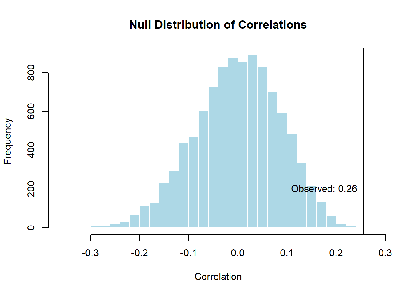
The final statistical test I want to perform is a permutation test. The visual tests have provided evidence suggesting there is a relationship between latitude and medals at the Summer Olympics. I’ll be testing the significance of the correlation between the two variables.
null hypothesis: There is no relationship between latitude and the number of medals won.
alternate hypothesis: There is a relationship between latitude and the number of medals won.
Code
set.seed(123)# define observed correlation between variablesobserved_correlation <-cor(latitude_medals_summer$latitude, latitude_medals_summer$total_medals)# permutation testn_permutations <-10000permuted_correlation <-replicate(n_permutations, { permuted_lat <-sample(latitude_medals_summer$latitude)cor(permuted_lat, latitude_medals_summer$total_medals)})# calculate p-valuep_value <-mean(abs(permuted_correlation) >=abs(observed_correlation))# visualize the resultshist(permuted_correlation, breaks =30, main ="Null Distribution of Correlations", xlab ="Correlation", col ="lightblue", border ="white")abline(v = observed_correlation, col ="black", lwd =2)text(observed_correlation, 200, paste("Observed:", round(observed_correlation, 2)), col ="black", pos =2)
Code
print(paste0("The p-value from this permutation test is: ", p_value))
[1] "The p-value from this permutation test is: 0.0029"
From the initial permutation test, we can draw conclusions from the histogram and p-value. Since the observed correlation value lies in the far right tail & the p-value is small (assuming a confidence level of 95%, where alpha = 0.05, p-value < alpha); we reject the null hypothesis and conclude the alternate. We can confidently conclude that the relationship between latitude and medals is significant.
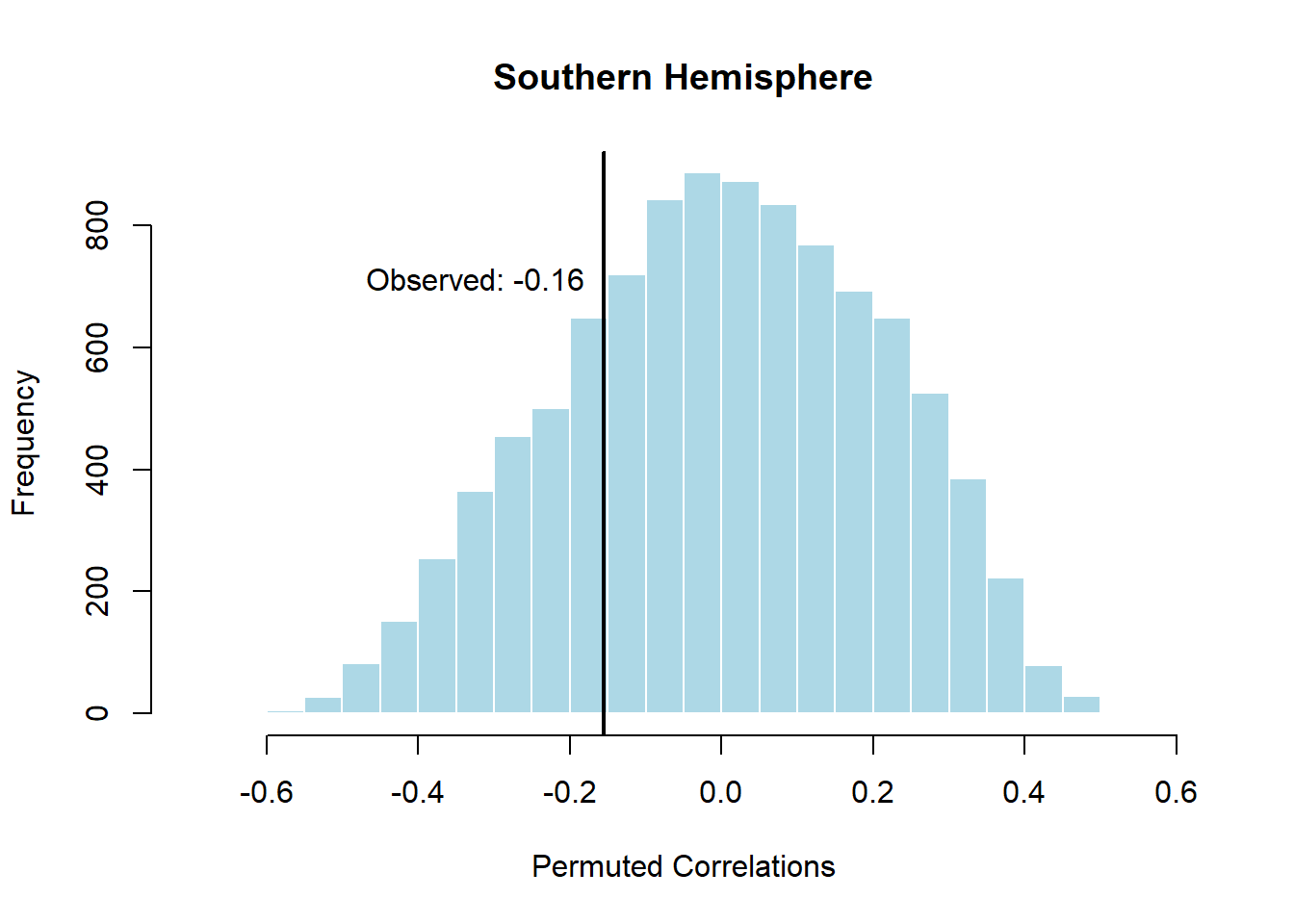
However, I’m skeptical about how the data is presented. As I mentioned earlier, there may be sampling bias due to the fact that the number of countries in the northern hemisphere outnumber those found in the southern hemisphere. I’ll take the permutation test one step further and conduct it on both hemispheres.
Code
# split data by hemispherenorthern_summer_data <-subset(latitude_medals_summer, hemisphere =="Northern")southern_summer_data <-subset(latitude_medals_summer, hemisphere =="Southern")# calculate correlation in each hemispherenorthern_correlation <-cor(northern_summer_data$latitude, northern_summer_data$total_medals)southern_correlation <-cor(southern_summer_data$latitude, southern_summer_data$total_medals)# create function for permutation test with visualizationpermutation_test_hist <-function(lat, medals, n =10000, title) { observed <-cor(lat, medals) permuted_corrs <-replicate(n, cor(sample(lat), medals))# P-value calculation p_value <-mean(abs(permuted_corrs) >=abs(observed))# generate histogram data hist_data <-hist(permuted_corrs, breaks =30, plot =FALSE) # don't plot, just get data# calculate dynamic x-limit based on the data xlim_range <-range(c(hist_data$breaks, observed))# add a buffer xlim_range <-c(xlim_range[1] -0.05, xlim_range[2] +0.05)# plot the histogram with dynamic x-limitplot(hist_data,col ="lightblue", border ="white", main = title,xlab ="Permuted Correlations", xlim = xlim_range )# plot the observed correlation lineabline(v = observed, col ="black", lwd =2)# position for text annotation text_position <-max(hist_data$counts) *0.8# paste observed valuetext(observed, text_position,paste("Observed:", round(observed, 2)),col ="black", pos =2 )return(list(observed = observed, p_value = p_value, permuted_corrs = permuted_corrs))}# set seed before calling functionset.seed(100)# pass data into functionnorthern_summer_test <-permutation_test_hist(northern_summer_data$latitude, northern_summer_data$total_medals, title ="Northern Hemisphere")
Code
southern_summer_test <-permutation_test_hist(southern_summer_data$latitude, southern_summer_data$total_medals, title ="Southern Hemisphere")
Code
# display resultscat("The p-value from the permutation test conducted on the northern hemisphere is:", northern_summer_test$p_value, "\n")
The p-value from the permutation test conducted on the northern hemisphere is: 3e-04
Code
cat("The p-value from the permutation test conducted on the southern hemisphere is:", southern_summer_test$p_value, "\n")
The p-value from the permutation test conducted on the southern hemisphere is: 0.4915
This time I get two different results from each test.
In the northern hemisphere: the result is statistically significant. Countries at higher latitudes are associated with winning more medals. This could reflect factors like greater representation, wealthier economies, or better sports infrastructure.
In the southern hemisphere: there is no evidence of a relationship between the two variables. The correlation is small and likely due to random chance.
Climate Region Analysis
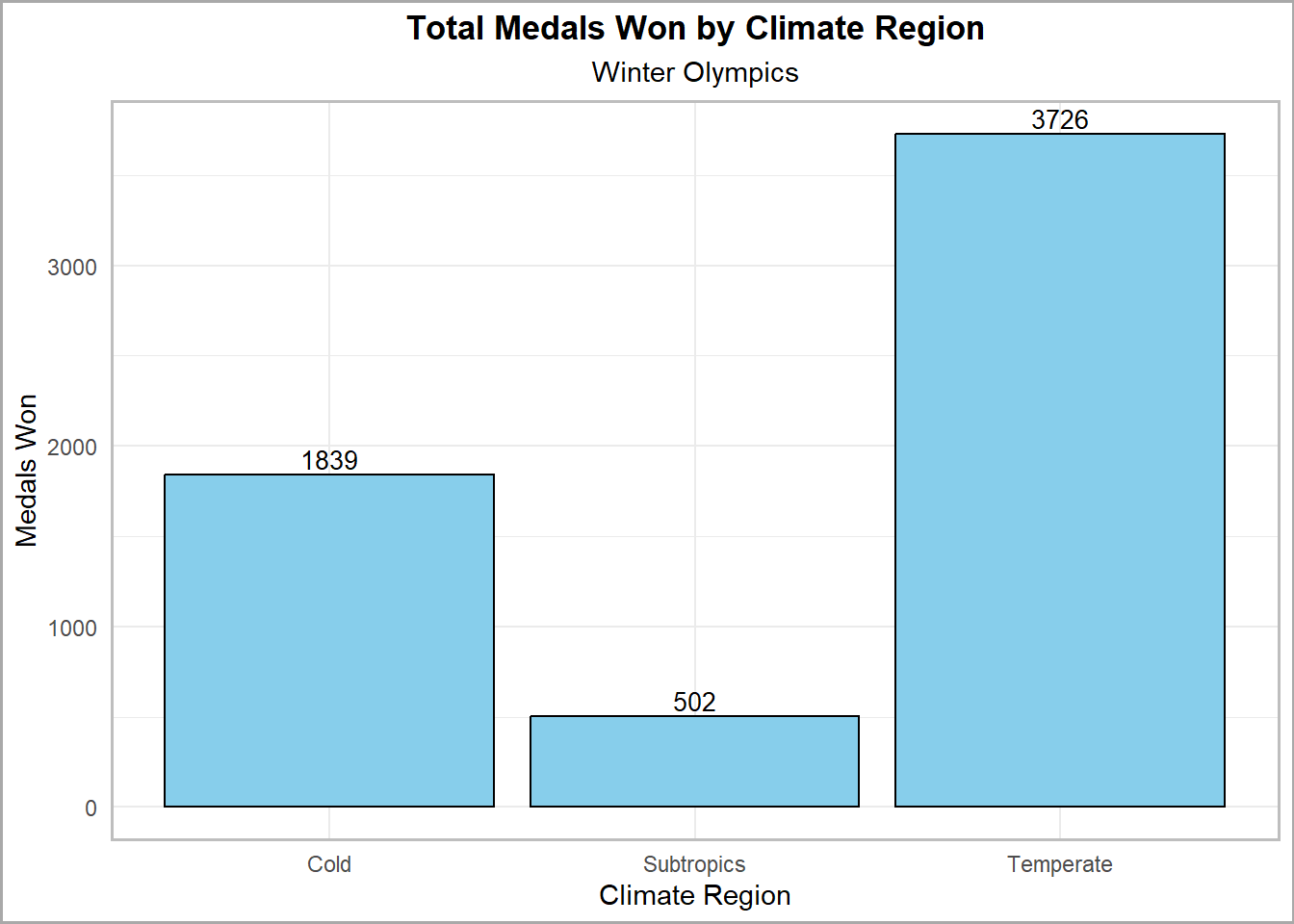
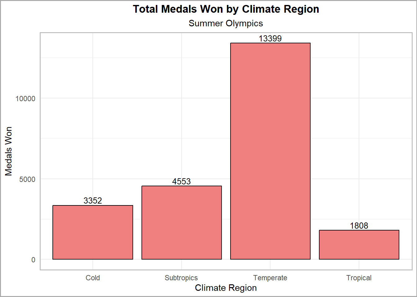
The next part of the analysis is to generalize the geographic locations based on climate. The Earth can be divided into four different climate zones based on latitude; cold, temperate, sub-tropical and tropical. We can try to derive some insights from a more generalized grouping approach than singular latitudes.
Code
# look at climate zones, define them as defined by Meteoblue: https://content.meteoblue.com/en/research-education/educational-resources/meteoscool/general-climate-zones# Tropical zone from 0°–23.5°, Subtropics from 23.5°–40°, Temperate zone from 40°–60, Cold zone from 60°–90°climate_zones <- country_coordinates |>mutate(region =case_when(abs(latitude) >=0&abs(latitude) <=23.5~"Tropical",abs(latitude) >23.5&abs(latitude) <=40~"Subtropics",abs(latitude) >40&abs(latitude) <=60~"Temperate",abs(latitude) >60&abs(latitude) <=90~"Cold" )) |>mutate(region =ifelse(country =="United States", "Temperate", region)) |># US is huge, most of it falls in temperate zone, some in subtropicalselect(country, region)# winter Olympic medal count by climate regionswinter_medals_by_climate <- climate_zones |>left_join(winter_medal_count,join_by(country == country)) |>select(country, region, total_medals) |>drop_na() |>group_by(region) |>summarize(regional_total_medals =sum(total_medals)) |>arrange(desc(regional_total_medals))ggplot(winter_medals_by_climate, aes(x = region, y = regional_total_medals)) +geom_col(fill ="skyblue", color ="black", size =0.5) +labs(title ="Total Medals Won by Climate Region",subtitle ="Winter Olympics",x ="Climate Region", # Add x-axis labely ="Medals Won" ) +theme_minimal() +geom_text(aes(label = regional_total_medals),vjust =-0.3, size =3.5, color ="black" ) +theme(panel.border =element_rect(color ="gray", fill =NA, size =1),plot.background =element_rect(fill ="white", color ="darkgrey", size =1),panel.background =element_rect(fill ="white"),plot.title =element_text(hjust =0.5, face ="bold"),plot.subtitle =element_text(hjust =0.5) )
Code
# Summer Olympic medal count by climate regionssummer_medals_by_climate <- climate_zones |>left_join(summer_medal_count,join_by(country == country)) |>select(country, region, total_medals) |>drop_na() |>group_by(region) |>summarize(regional_total_medals =sum(total_medals)) |>arrange(desc(regional_total_medals))# bar plot representationggplot(summer_medals_by_climate, aes(x = region, y = regional_total_medals)) +geom_col(fill ="lightcoral", color ="black", size =0.5) +labs(title ="Total Medals Won by Climate Region",subtitle ="Summer Olympics",x ="Climate Region",y ="Medals Won" ) +theme_minimal() +geom_text(aes(label = regional_total_medals),vjust =-0.3, size =3.5, color ="black" ) +theme(panel.border =element_rect(color ="gray", fill =NA, size =1),plot.background =element_rect(fill ="white", color ="darkgrey", size =1),panel.background =element_rect(fill ="white"),plot.title =element_text(hjust =0.5, face ="bold"),plot.subtitle =element_text(hjust =0.5) )
Evidently, countries in the temperate zone have the most medals. We’ll conduct an ANOVA test to confirm how significant this is.
Code
# perform ANOVA analysis on this since there shouldn't be a linear relationship# define climate zones in summer gamessummer_games_climate <- climate_zones |>left_join(summer_medal_count,join_by(country == country)) |>select(country, region, total_medals) |>drop_na()# define region as a factor for analysissummer_games_climate$region <-as.factor(summer_games_climate$region)# use built in ANOVA functionsummer_anova <-aov(total_medals ~ region, data=summer_games_climate)summary(summer_anova)
             Df   Sum Sq Mean Sq F value   Pr(>F)
region        3  3355814 1118605   6.391 0.000448 ***
Residuals   131 22930236  175040
---
Signif. codes:  0 '***' 0.001 '**' 0.01 '*' 0.05 '.' 0.1 ' ' 1
In the Summer Olympics, the p-value confirms that regions have a significant effect on medal counts.
Code
# define climate zones in winter gameswinter_games_climate <- climate_zones |>left_join( winter_medal_count,join_by(country == country) ) |>select(country, region, total_medals) |>drop_na()# define region as a factor for analysiswinter_games_climate$region <-as.factor(winter_games_climate$region)# use built in ANOVA functionwinter_anova <-aov(total_medals ~ region, data = winter_games_climate)summary(winter_anova)
            Df  Sum Sq Mean Sq F value Pr(>F)
region       2  412515  206258   5.243   0.01 *
Residuals   36 1416101   39336
---
Signif. codes:  0 '***' 0.001 '**' 0.01 '*' 0.05 '.' 0.1 ' ' 1
In the Winter Olympics, the p-value confirms that regions have a significant effect on medal counts.
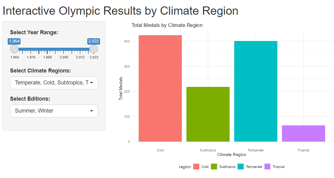
Climate Region Widget
Click on the image for interaction!
Conclusion
The major takeaway from this analysis is that a significant relationship exists between a country’s location and success at the Olympics, especially in the northern hemisphere. However, we need to consider that the majority of the world’s landmass and population is situated in the northern hemisphere. We can attribute location as a key factor that may have influenced other determinants of success, such as economic development, access to resources, and sports culture.
Additionally, climate zones play a crucial role in shaping the types of sports countries prioritize and invest in, further impacting their medal counts. Countries in more temperate climates may have an advantage in both seasonal sports, while those in extreme climates might specialize differently.
The majority of the medals are held by a smaller group of countries, hinting that they may have better access to resources and infrastructure. Keep in mind that the majority of the participating nations are located in the northern hemisphere, which may be a key bias in this study. The ultimate limitation is that locations are predetermined and each country is subject to their own surroundings and cannot do much in altering what they are given by nature.
Future Potential Work
If I were to continue this analysis, I would like to explore the historical connections between geography, resource availability, and national power, examining how these factors have shaped the rise of nations and their resulting global success in the context of the Olympics. By analyzing key case studies of countries that leveraged their geographical advantages and natural resources to achieve economic and political prominence, this study aims to illuminate the patterns underlying their Olympic achievements.